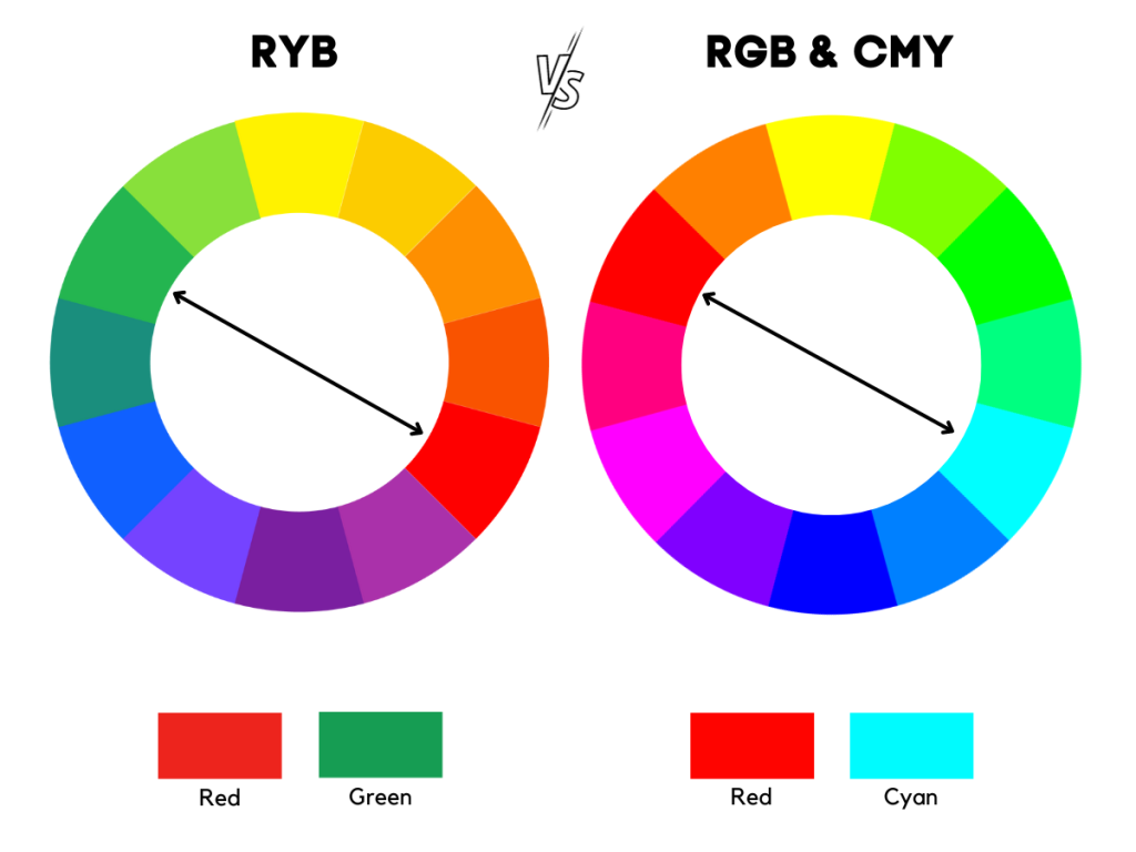
Now, let's talk about the color wheel, which is like a big circle of colors. It's a handy tool that helps artists and designers choose colors that work well together. And, fun fact: the color wheel is divided into primary colors (red, blue, and yellow), secondary colors (orange, green, and purple), and tertiary colors (colors like blue-green and red-violet).
But, what makes the color wheel really cool is that it shows us how colors are related to each other. For example, did you know that the complementary colors (colors that are opposite each other on the wheel) can make each other look brighter and more vibrant when used together?
So, back to red and its opposite, green. When you use these two colors together, they can create a pretty dramatic effect. Just think about it: red is a warm color that can evoke feelings of passion and energy, while green is a cool color that can make us feel calm and relaxed.
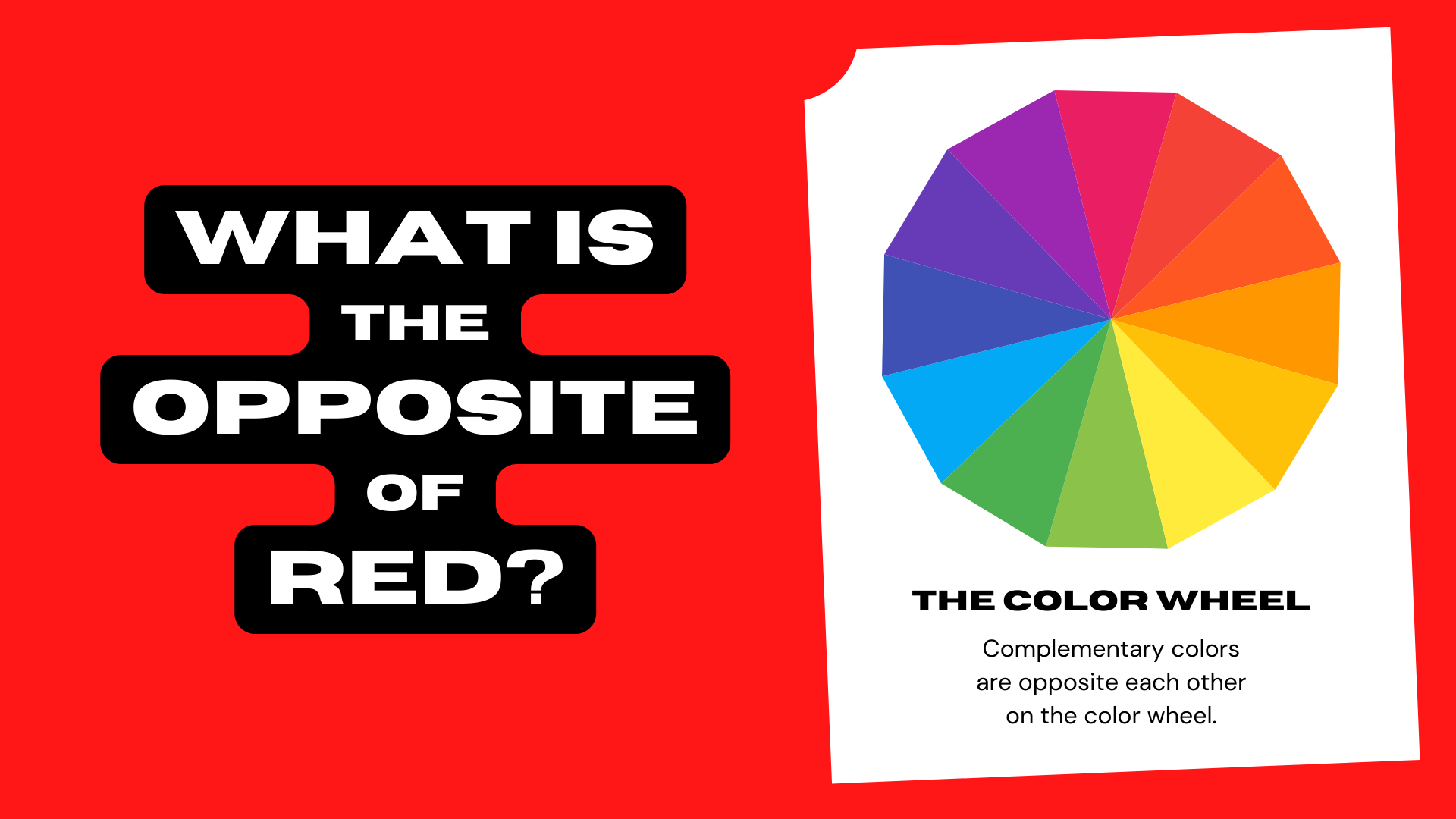 What Is the Opposite of Red? (Complementary Color) | Color Meanings