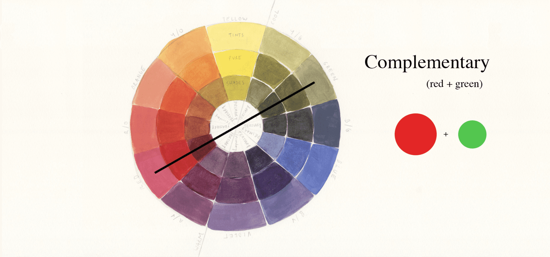
Red is a warm colour that can evoke feelings of energy, passion, and excitement - which is probably why it's so often used in design and marketing. But when we contrast red with cooler colours like blue or green, it can create a really interesting visual tension. It's like a game of tug-of-war between the warmth of the red and the coolness of the other colour.
For instance, imagine a red sports car against a calm blue sky - the contrast between the two colours makes the car seem even more speedy and dynamic. Or, picture a red rose against a lush green background - the contrast between the two colours makes the rose seem even more romantic and beautiful. It's all about creating a sense of visual interest, right?